Winning Audiology Website Design Tips
Is your audiology website getting you more patients in the door?
It should be. Give us a call today!
…
Read more
Is your audiology website getting you more patients in the door?
It should be. Give us a call today!
…
Read more
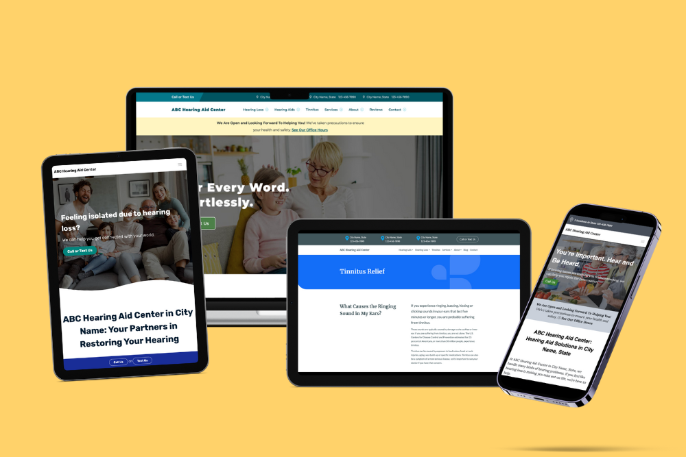
What’s the first thing people notice about your audiology practice? In our digital age, it’s probably your website. Gone are the days when introductions took […]

Whether you need to create a new website or reimagine an old one, the importance of your online presence cannot be overestimated. Think of it […]
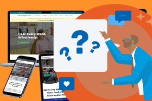
Almost every audiology practice owner we talk to loves their website until we ask them one key question.What’s it doing for you?… Read more