Why Your Website Has A Style Problem
Here’s a quick tip from us about your website. We’ve got bad news.
You’ve got style problems.…
Read more
Here’s a quick tip from us about your website. We’ve got bad news.
You’ve got style problems.…
Read more
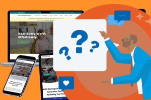
What’s the first thing people notice about your audiology practice? In our digital age, it’s probably your website. Gone are the days when introductions took […]

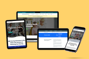
Whether you need to create a new website or reimagine an old one, the importance of your online presence cannot be overestimated. Think of it […]
Everyone loves art. Even if you’ve never set foot inside an art museum, you probably have art hanging on your walls. And, hopefully, every time […]